Colour & Mood in Art
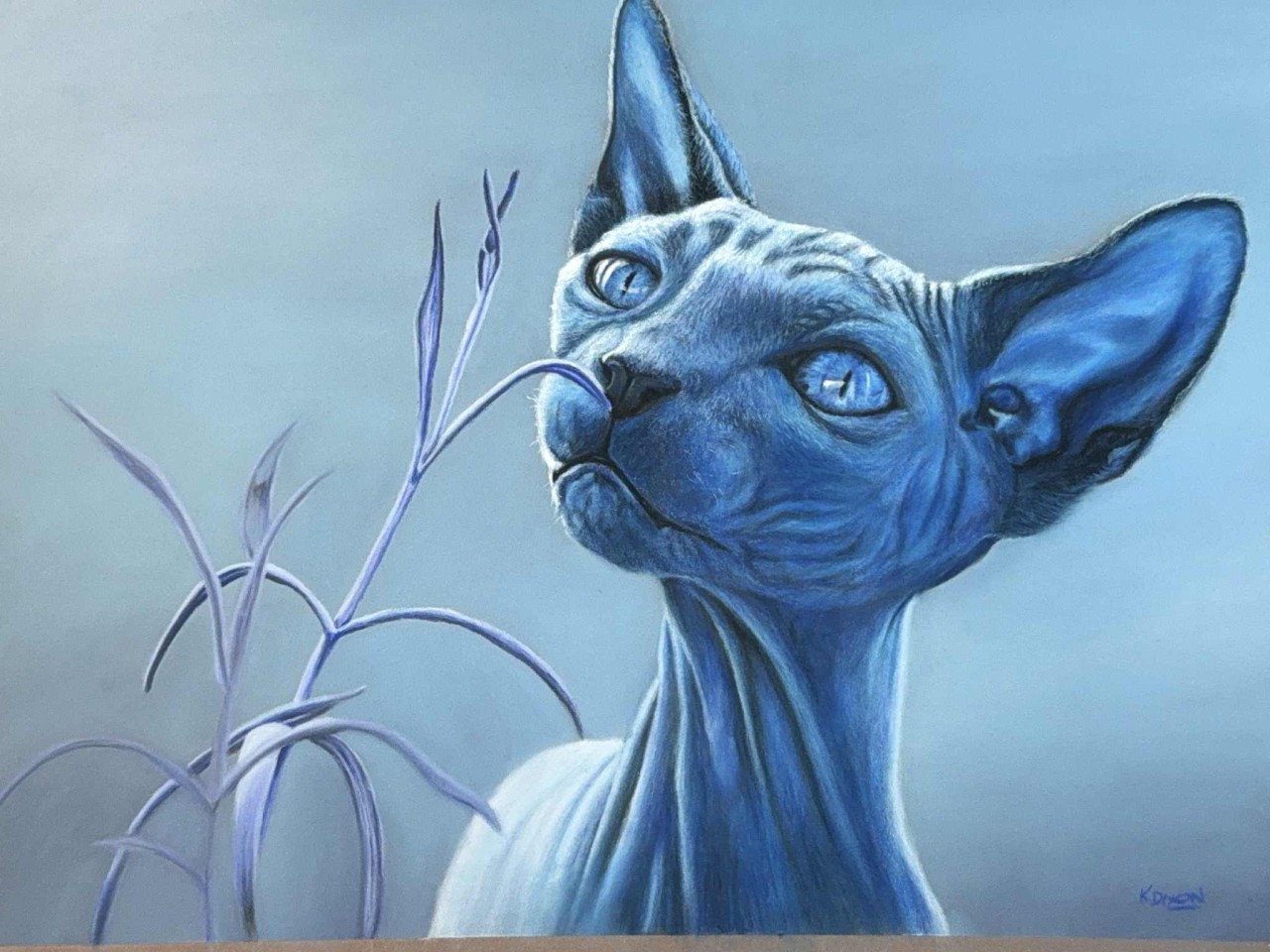
 Kerri Dixon
“Colour isn’t just decoration. Explore how the hues you choose shape both your viewer’s feelings and your creative state, with practical tips for usin
Colour and Mood in Art: How to Use Colour to Shape Emotions in Your Work
Colour isn’t just about making a painting look beautiful — it’s one of the most powerful emotional tools we have as artists. The colours you choose can shape how your artwork feels to a viewer, but they also impact how you feel while creating it.
In this post, we’ll look at how colour influences mood, both biologically and culturally, and how you can use that knowledge to enhance your art (and your own state of mind).
Why Colour Feels So Powerful
Science tells us colour connects to emotion in two key ways:
-
Biological response – Our brains are wired to react instinctively. Red signals danger or urgency (think stop signs and emergency buttons), while green feels safe and balanced (like a traffic light telling us it’s okay to move forward).
-
Cultural associations – Over time, societies attach meaning to colours. Albert Munsell, creator of the Munsell Colour System, wrote that repeated linking of a colour with an idea “conditions” the brain. For example:
-
Purple = royalty
-
Black = mourning in many cultures (but in others, like China, white is linked with mourning)
-
Red + green = forever tied to Christmas
-
These associations become so strong that they’re nearly impossible to separate from their cultural context.
68d1f30f6f6da_lg.png)
How Colours Shape Mood in Art
Different colours evoke different emotional tones. Here are some of the most common associations:
-
Blue – calming, tranquil, sometimes sadness
-
Red – passion, energy, anger, power
-
Yellow – joy, warmth, but also anxiety in excess
-
Green – balance, renewal, nature
-
Purple – mystery, spirituality, luxury
-
Black/Neutrals – seriousness, grief, strength
When you’re planning a painting, think not just about accuracy, but about how these colours feel.
Famous Artists Who Mastered Mood Through Colour
-
Rembrandt used golden light and deep shadows for intimacy and drama.
-
Turner harnessed fiery reds and yellows to paint chaos and energy, while stormy blues conveyed fragility.
-
Goya’s Black Paintings used muddy, muted tones to create a sense of heaviness and unease.
-
Monet’s Water Lilies are pastel meditations in lilacs and blues, inviting calm and stillness.
-
Van Gogh poured raw emotion into swirling blues (Starry Night) and radiant yellows (Sunflowers).
Colour and You, the Artist
Colour doesn’t just affect viewers — it shapes how you feel while creating.
-
Bright, bold colours (yellows, pinks, oranges) can lift your mood and re-energise you.
-
Blues and greens can slow racing thoughts and bring calm.
-
Stormy purples, dark greys, or fiery reds can help you process heavy emotions.
-
Even just playing with your favourite colour in abstract shapes can reconnect you with joy.
Sometimes, the best therapy is a simple five-minute “colour doodle” with no pressure to finish a polished work.
Practical Ways to Explore Colour and Mood
-
Try a monochrome study in one colour family and see what mood emerges.
-
Keep a colour journal: swatch palettes, note your feelings, and use it for future reference.
-
Create paintings or series around the emotions you want to convey, not just the colours in your reference photo.
Colour is more than decoration — it’s a language of emotion. Learn to use it deliberately, and you’ll not only create more powerful art, but you may also find new ways to support your own mental well-being along the way.
Kerri xx
Learn to draw animals in Soft Pastels with me inside
The Creative Barn Essentials Tier
Categories: : art, educational, fundamental
Want to learn about Soft Pastels?
Click on the button to register and get instant access to the free Pastel Basics for Beginners workshop.
Listen as I walk you through the essentials supplies needed to get started in Pastel painting.
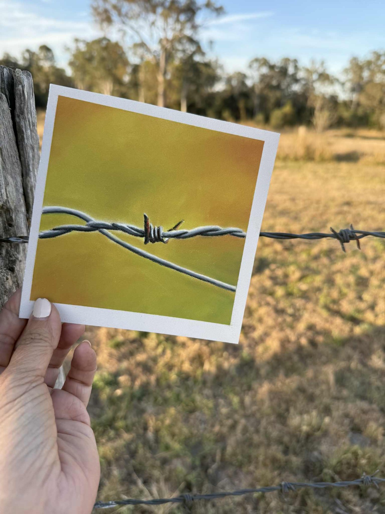
I teach you how to create this little barbed wire piece during the class. Everything you need is in the PDF workbook you'll receive when you register.