Composition – The Unsung Hero of Great Art
 Kerri Dixon
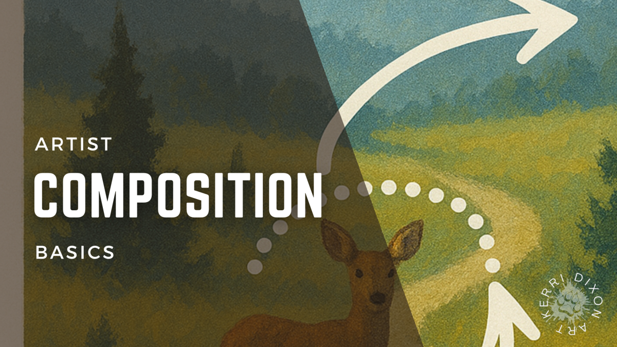
Learn how to use composition to create stronger, more engaging art. Discover tools like rule of thirds, leading lines, and negative space in this deep
It might not sound as thrilling as colour mixing or layering fur textures, but composition is absolutely foundational if you want your art to feel balanced, emotive, and professional. In this week’s Tuesday Art Chat, we explored why it matters, when to start focusing on it, and how to spot the difference between a "meh" painting and one that just works.
What Is Composition and When Should You Start Thinking About It?
A lot of beginners (especially those following step-by-step tutorials) don’t focus too much on composition at first—and that’s totally fine. When you’re learning, you’re absorbing a lot! But when you start creating your own pieces and choosing your own reference photos or scenes, that’s when composition becomes essential.
Composition is the blueprint of your artwork. It’s the arrangement of visual elements that guides the viewer’s eye and evokes emotion. If it’s done well, your piece feels harmonious and inviting. If it’s not, something will just feel… off. Viewers might not know why, but they’ll sense that something isn’t quite right.
Common Composition Tools & Techniques
Let’s break down the most helpful tools and principles I use in my own work:
🌿 Rule of Thirds
Divide your canvas into a 3x3 grid. The four points where those lines intersect are your power spots—perfect for placing focal elements like an animal's eye, a dramatic flower bloom, or even a horizon line.
Pro Tip: You can turn on a thirds grid in your phone camera settings! It's a great tool when composing reference photos.
🌈 Colour Contrast

Using complementary colours (like red against green) can make certain elements pop. This helps direct the viewer's attention to your focal area.
🌧️ Value Contrast
Light against dark draws the eye. If everything is mid-tone, nothing stands out. Use values intentionally to create depth and to direct the gaze.
🔮 Focus and Blur
Sharp details at the focal point, with softer edges elsewhere, create depth and naturally pull the eye toward where you want it to go.
⚖️ Golden Mean & Diamond Guide
More advanced, but powerful: the golden ratio is found in nature (like in seashells or flower petals) and can make compositions feel pleasing and balanced. The diamond guide helps you visualize strong diagonal paths and triangular shapes that lead the eye around the artwork.
↙️ Leading Lines
These are lines (real or implied) that direct the viewer’s eye toward your subject. Think: a tail pointing to the face, a log leading to the main flower, or even a shadow angling toward your focal point. Artists can add or move these intentionally!
◻ Negative Space
This one is HUGE in my own work. Negative space is the empty area

around your subject. It creates breathing room and balance. If your piece feels too busy or claustrophobic, try giving your subject more space.
🌳 Framing
Use elements like branches, rocks, or light to subtly frame your subject. This can be especially powerful in landscape scenes or animal portraits.
⟳ Visual Flow
How does the eye move across your piece? S-curves, C-curves, and triangular layouts help create natural movement and flow. You want to keep your viewer in the painting—not send their gaze off the edge.
⚖️ Balance & Visual Weight
Balance isn’t just symmetry. It’s about distributing visual weight. A small but detailed area can balance a large simple one. A dark patch can balance a bright shape.
Common Composition Mistakes to Avoid
- Centering everything by default.
- Over-detailing everything equally (you need contrast in focus).
- Tangents where edges just touch awkwardly.
- Subject too close to the edge with no breathing room.
- Lack of clear focal point due to equal visual weight everywhere.
Real World Examples from My Work
In the blog version of this chat, I showed examples of my own paintings and how I used:
- Rule of Thirds in my penguin family piece
- Negative space and leading lines in my gumflower and cow artworks
- S-curves and contrast in my beach shell setup
Each of these tools adds intention to the way I build my scenes, even when I’m pulling together multiple photo references or altering the layout digitally.
Quick Tips to Start Using Composition Like a Pro
- Use a grid on your phone camera when taking photos.
- Edit references in Canva or Photoshop to move elements around.
- Try thumbnail sketches to quickly test different compositions.
- Don’t overthink it: trust your eye. If it looks "off," something probably is.
- Focus your detail: not everything should be sharp. Guide your viewer.
Want to Go Deeper?
If you’re a member of The Creative Barn Premium Tier, we go into all of this in more detail in Module 4, including Photoshop demos and examples from my own work.
If you’re not a member yet, join the waitlist.
We’re all about helping you build real skills and confidence so you can start creating your own amazing pieces—not just follow someone else’s steps.
Thanks for reading! Got questions or want me to critique one of your pieces? Drop a comment or tag me—let’s talk composition!
Until next time, schedule some art time this week. It’s good for the soul. ✨
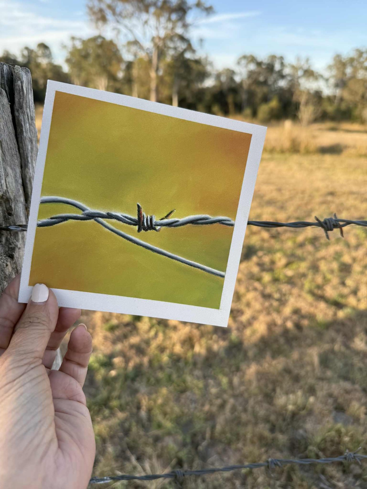
Want to learn about Soft Pastels?
Click on the button to register and get instant access to the free Pastel Basics for Beginners workshop.
Listen as I walk you through the essentials supplies needed to get started in Pastel painting.
I teach you how to create this little barbed wire piece during the class. Everything you need is in the PDF workbook you'll receive when you register.