Drawing Fur - Black and Straight
 Kerri Dixon
Join me as I give you a breakdown of how I tackle black fur in soft pastels.

Black and Straight Fur Drawing
Fur in general has 2 main rules and that is direction and length. If you make sure you art studying your reference image regularly, then you can follow the direction as it shifts over the animals bone structure, and then the length depends on the type of animal. Although a single animal can have various fur lengths eg. Lion, the face is short, the mane is long.
There are so many different fur types such as long, curly, wavy, short, wiry, fluffy, wet and so on. Practicing in small squares is a great way to get familiar with each. The best way to get good at it is to just keep drawing. Start with the undertone, then add the fur strokes on top. I do like to give my fur a light blend with my finger after a while and then start again with the strokes, this helps to build depth in the fur, but I find Pastelmat is the only paper that I can do this successfully.
As I said there are so many different fur types so in this blog I decided to concentrate on just one, which is black straight fur.
Black fur is never really just black and the same applies to white fur.
The first thing you need to make sure of is your reference image has good value contrast in it. Black animals can be hard to get a good photo of because without the right lighting, they just look like a black blob. If you are planning on drawing one, you need to be able to see where the value changes are as the light hits the different highs and lows on the face which are created from the bone and muscle structure. The same applies for white animals too. I think black animals are better photographed in the sun whereas white animals are better photographed in the shade.

It’s quite amazing how little black is used in drawing a black animal. We want to save it for the areas that are the darkest, so those areas that are in the shadows and showing the true colour of the coat. If you were drawing a brown dog, then you would find an area that is neither in the light or in shadow and that would be the true colour of the dog. You can then go either side of it with lighter or darker shades. But with a black dog, you are already starting at the darkest colour, so the black is used on the areas that are in the shadows and then we build up to the highlights with tones that are only a few shades lighter than black.
I do find drawing black animals less challenging than white because you can lay down a dark value and then build over the top with fur strokes. The lighter fur strokes pick up the value underneath but it adds to the blending in process. We don’t want our lighter fur strokes standing out too much on a dark animal. It’s just a subtle shift in values.


The first thing with straight fur is to block in the values underneath with either a soft pastel stick or pan pastels. You could just build the fur layers up using pastel pencils, but I find that blocking in first saves a lot of time and especially with black fur you want that dark solid undertone down before we start with the fur strokes.
So remember to put black down in the darkest areas and then in this case I used a really dark blue for the areas that the light was hitting. If you found the coat reflections were more warm colours then this is where you would put down a really dark red instead of blue.

Once you have the base colours down and blended into the paper with your finger, then you can start adding fur strokes with your pastel pencils.
The main trick is to concentrate on the fur direction and length. I probably observe my drawing 50% of the time when drawing fur to make sure I am getting this right.

I always like to have a dark, midtone and light of the colours I am using in my pencils. You need to build up quite a number of layers with all 3 of these pencils, using the dark to blend into the black area you blocked in so it has a smooth fur transition and not a solid line. I also add some of the dark strokes throughout this lighter area. Your midtone pencil should be the main fur stroke colour that you use and will cover the entire area in strokes. Then the highlight pencil will just be used for strokes where you can see the light is hitting the most, creating the lightest fur.
Once you have a number of layers built and you are happy with how the values are looking, then I rub over this very lightly with my finger, in the direction of the fur strokes. This helps to push the pastel into the paper so you can add more layers, but it also creates some soft blurry fur that once you add more layers over the top creates a feeling of depth in your fur.
You can only do this with Pastelmat paper. I have found if you do this with other sanded pastel papers, you end up just blending in all the strokes you just created which is not the effect we want. You want to still be able to see the fur strokes, they are just a bit subdued ready for more brighter ones over the top.

I've set the date for the first Coaching Week of the year and that is March 7th, so make sure if you want to join in the fun of drawing animals in pastel and charcoal to get on the waitlist so your first to know when registrations open. CLICK HERE TO JOIN THE WAITLIST and I'll send you a FREE online lesson.
Kerri xx
Ready to take your artistic journey to the next level? Join our vibrant Facebook Group community today and unlock your free PDF guide on building confidence as an artist. Let's embark on this creative adventure together!
Click the link here to start your adventure!
Want to learn about Soft Pastels?
Click on the button to register and get instant access to the free Pastel Basics for Beginners workshop.
Listen as I walk you through the essentials supplies needed to get started in Pastel painting.
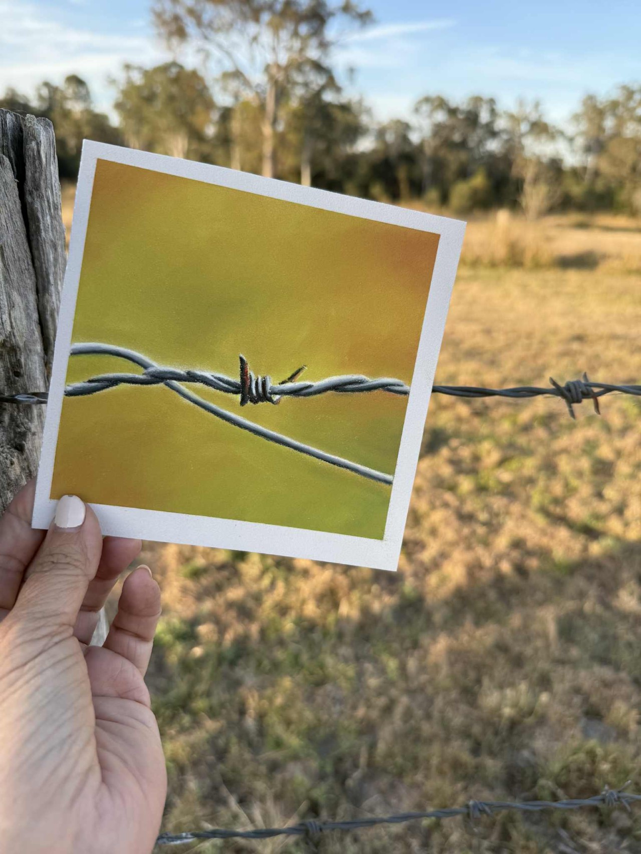
I teach you how to create this little barbed wire piece during the class. Everything you need is in the PDF workbook you'll receive when you register.