Tone and Value
 Kerri Dixon
What's the difference between tone and value?
Tone and Value
What’s the difference between Tone and Value? Well not really anything, both words refer to the same thing and that is the variation in lightness from white through to black. “Value” simply means how light or dark something is.
So both words are usually put together and used by many artists to refer to Tonal Values in a piece of work.
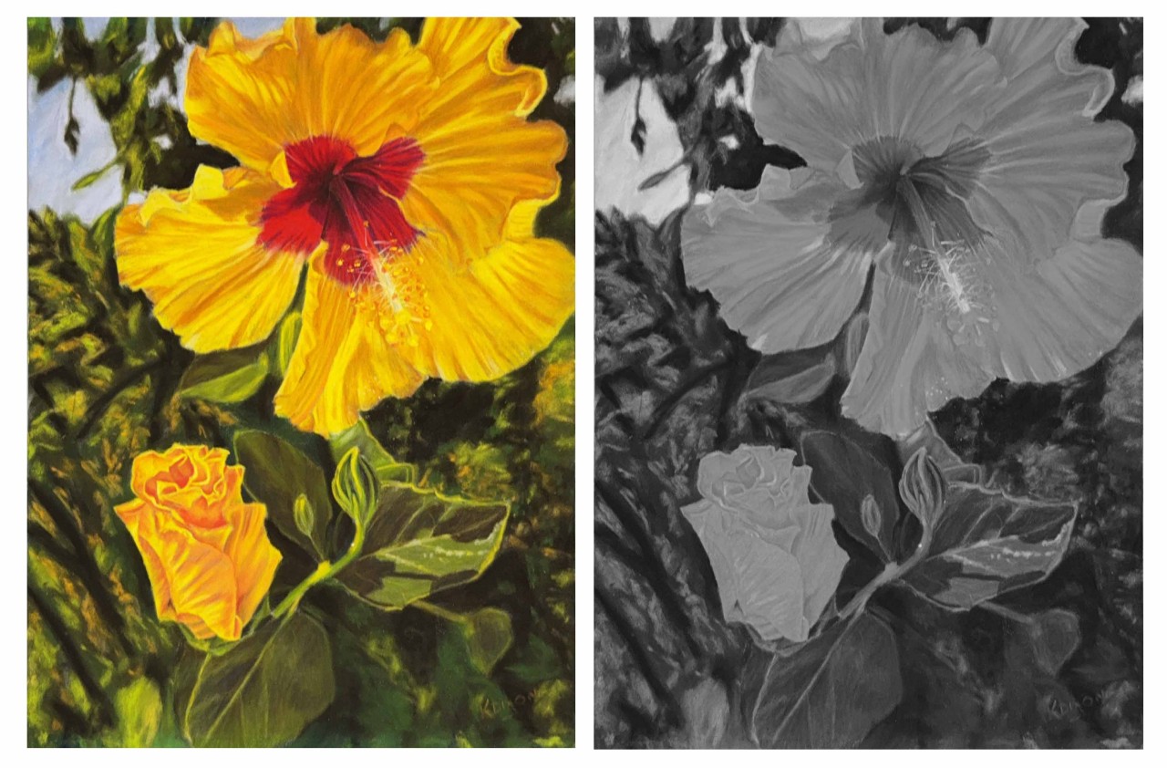
For example: If you took a black and white photograph of your painting, the shades of grey would be the different values or tones within the painting, or another way to word it would be ‘the tonal values within the painting’. It is always great practice to look at the tonal values within your painting as they can be used to lead a viewers eye and create a great composition. They are also what gives us the ability to create that 3 dimensional look. Value is the lightness or darkness of a colour or hue.
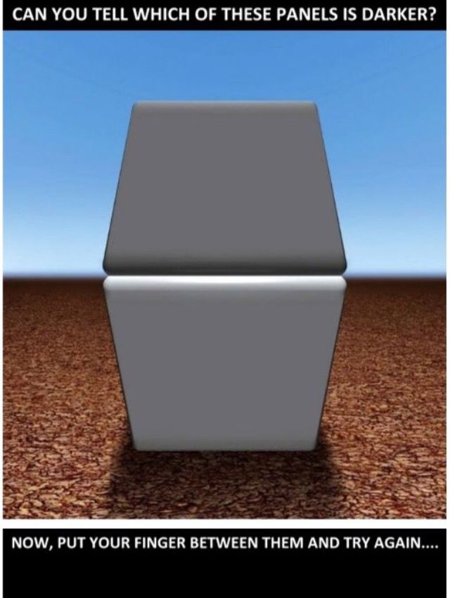
Our perception of how bright something is changes depending on what surrounds it. The example above shows the same 50 per cent grey surrounded by black and white. Can you see how the grey looks much darker against the white background? This effect happens all the time when we draw from observation and it can really throw off our value judgements.
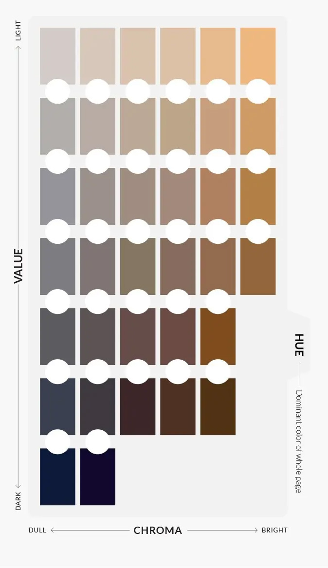
You can see to below, the variations in tonal values as it refers to all colours, not just grey scale. Why most artists turn their painting to grey scale is because it it easier to see the difference, but as you can see with this diagram, all colours can also be placed in this scale of tonal values, it can just sometimes be harder to see it with colour.
A great way to get started on tonal values is to create your very own tonal chart that you can use over and over again, it is very handy to have one when you are drawing or painting to determine exactly what percentage of colour or shade is needed. Sometimes your eyes can be deceived, so putting a scale next to your photo or holding it out at arms length to the scene can help quite a lot. I created a Youtube video with a free downloadable template for you to follow along and create your own. Just follow this link to watch it. Another thing to do is check out some very talented artists that work only in black and white for inspiration and to see how they use tonal values in their work to catch your attention. One of my favourites is Adonna Khare who works primarily in carbon pencils. She is an amazing draughtsman and I just love her imagination when it comes to the creatures she draws. Definitely check her out over on Facebook Adonna Khare Artist
Here’s another great resource to download, and that’s the Denman ross value scale. Here’s the link to get your own, it is a great accompaniment to the tonal scale you make yourself. https://illustratorslounge.com/lounge-notes/the-denman-ross-value-scale/
If you would like to continue learning or discussing anything about tonal values or if you have any other drawing related questions, then be sure to join my private Facebook group “Drawing Wildlife and Nature – Beginners to Advanced” where I will be happy to answer anything I can.
I'd also love you to join my online membership THE CREATIVE BARN waitlist where you will be first to know when the doors swing open again, plus you'll receive a FREE tutorial while your waiting.
DOORS ARE OPENING VERY SOON TO THE CREATIVE BARN MEMBERSHIP CLICK HERE TO LEARN MORE ABOUT THE MEMBERSHIP
Until next time, have a great week and keep creating.
Kerri xx

Categories: : art, beginner, educational
Want to learn about Soft Pastels?
Click on the button to register and get instant access to the free Pastel Basics for Beginners workshop.
Listen as I walk you through the essentials supplies needed to get started in Pastel painting.
I teach you how to create this little barbed wire piece during the class. Everything you need is in the PDF workbook you'll receive when you register.